03
ANT
Automatic Note Taking Tool
A Figma prototype for an application that helps university students take notes during lectures in sync with presentation slides and voice transcripts

A Figma prototype for an application that helps university students take notes during lectures in sync with presentation slides and voice transcripts
ANT (Automatic Note Taking Tool) was designed to revolutionize how university students take notes during lectures. The project focused exclusively on understanding and addressing the emotional journey of students during classes, recognizing that traditional note-taking methods often fail to capture the full context of lectures.
Our research revealed that students struggle with multitasking during lectures - trying to listen, understand, and write notes simultaneously often leads to missed information and poor retention. ANT was designed to synchronize note-taking with presentation slides and voice transcripts, creating a more seamless learning experience.
Emotional Satisfaction
Improved Focus
Months Duration
We conducted extensive research to understand the emotional states students experience during lectures:
Our design strategy focused on addressing these emotional needs:
We began by conducting focus groups with both students and professionals to uncover unique pain points. Key findings and user needs were synthesized and mapped visually to guide our direction.

We mapped the end-to-end student journey and crafted a mood board to define the app’s visual tone—bright, energetic, and student-friendly.


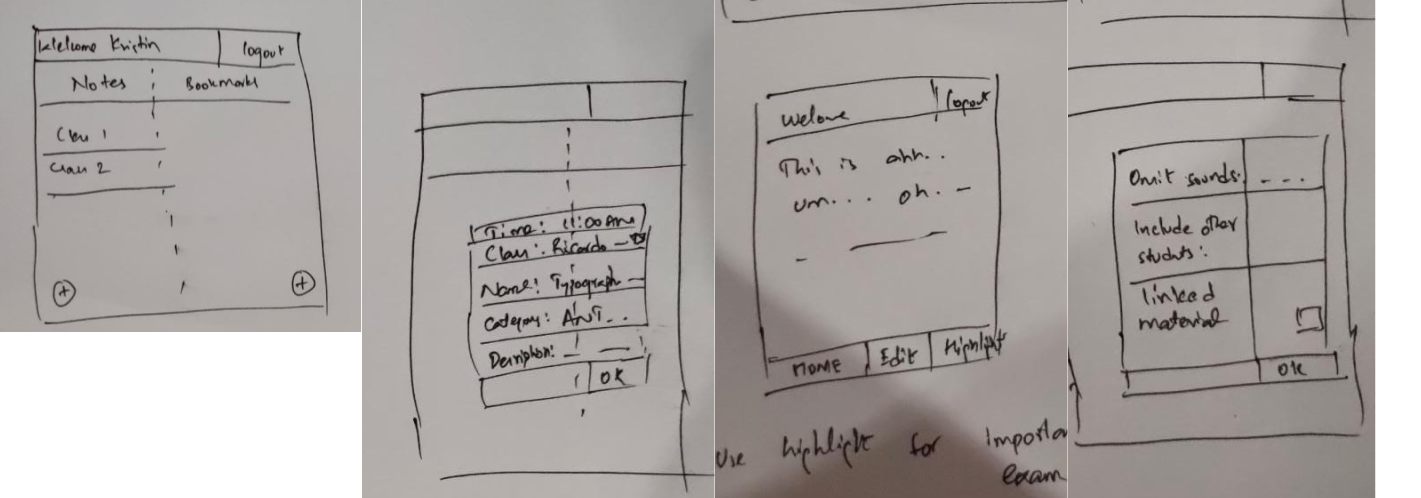
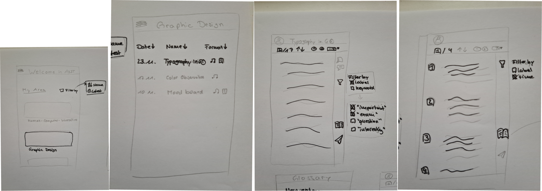
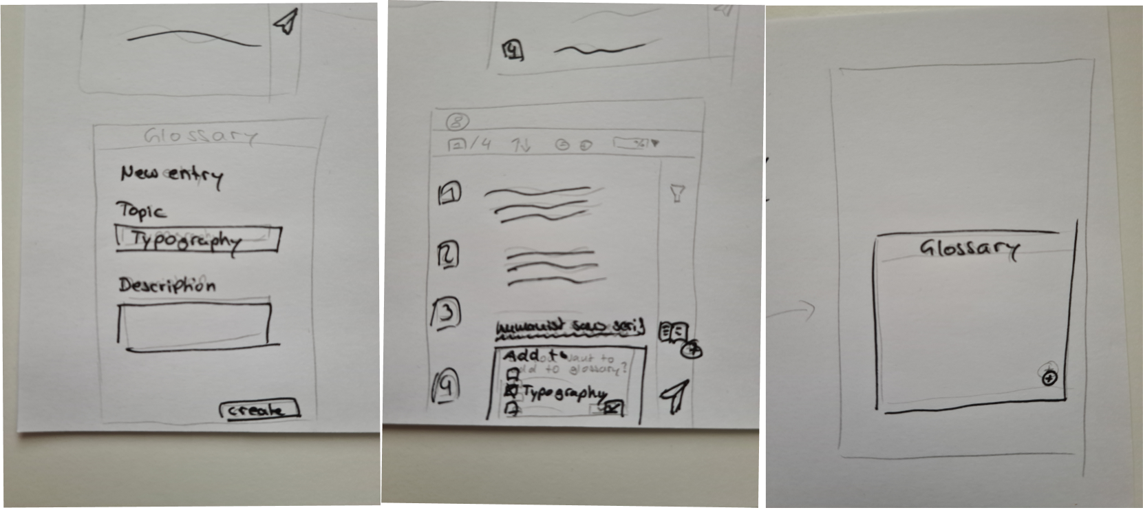
Rapid pen-and-paper sketches and low-fidelity wireframes allowed us to quickly iterate on layout, navigation, and core interactions before moving to digital design.
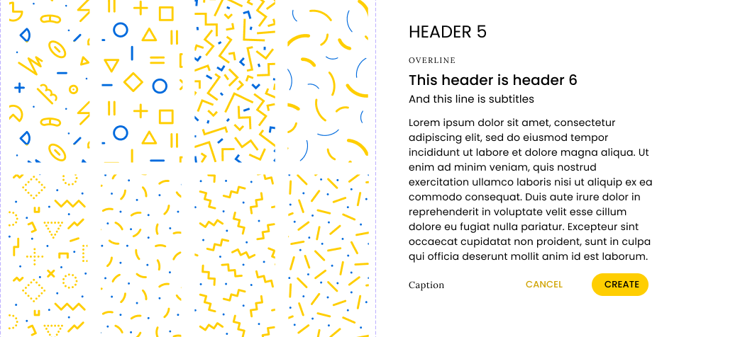
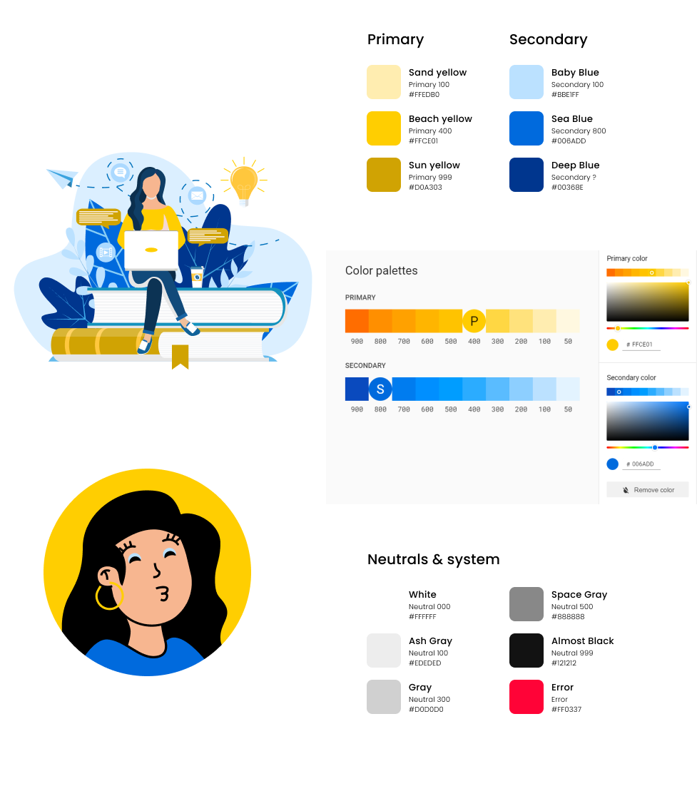
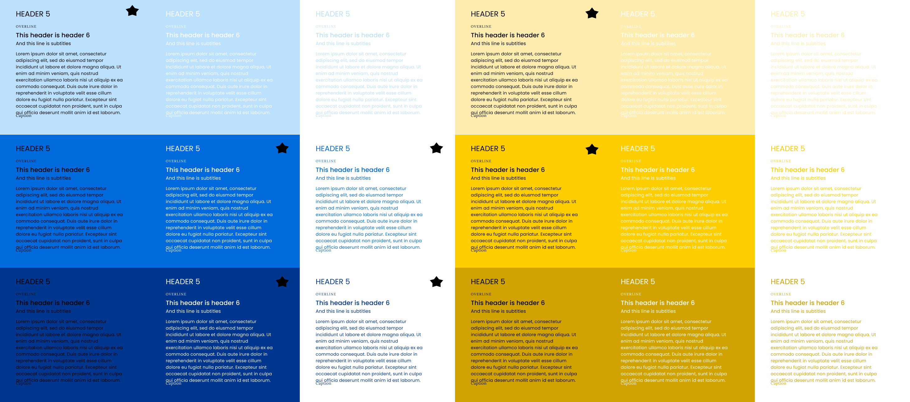
We established a robust design system inspired by our mood board, ensuring visual consistency, accessibility, and scalability across the product.
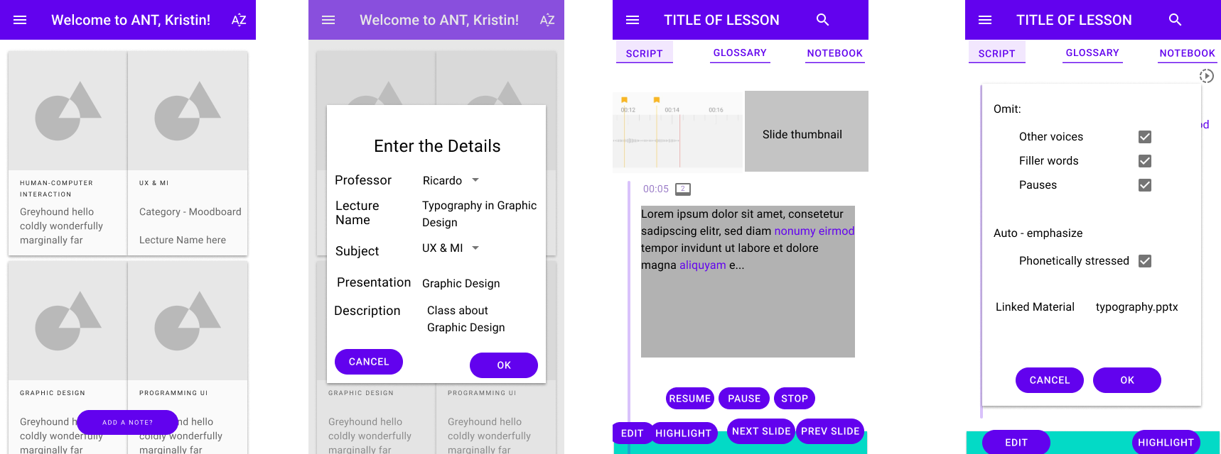
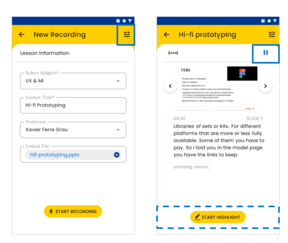
Our high-fidelity prototype brought together research insights and design principles, resulting in a polished, test-ready product experience.
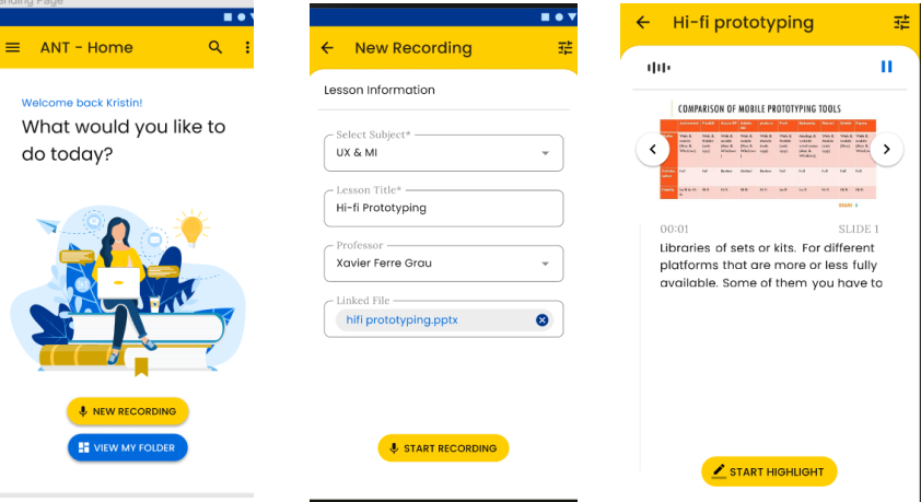
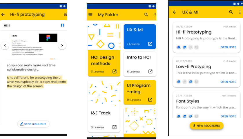
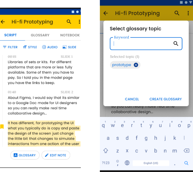
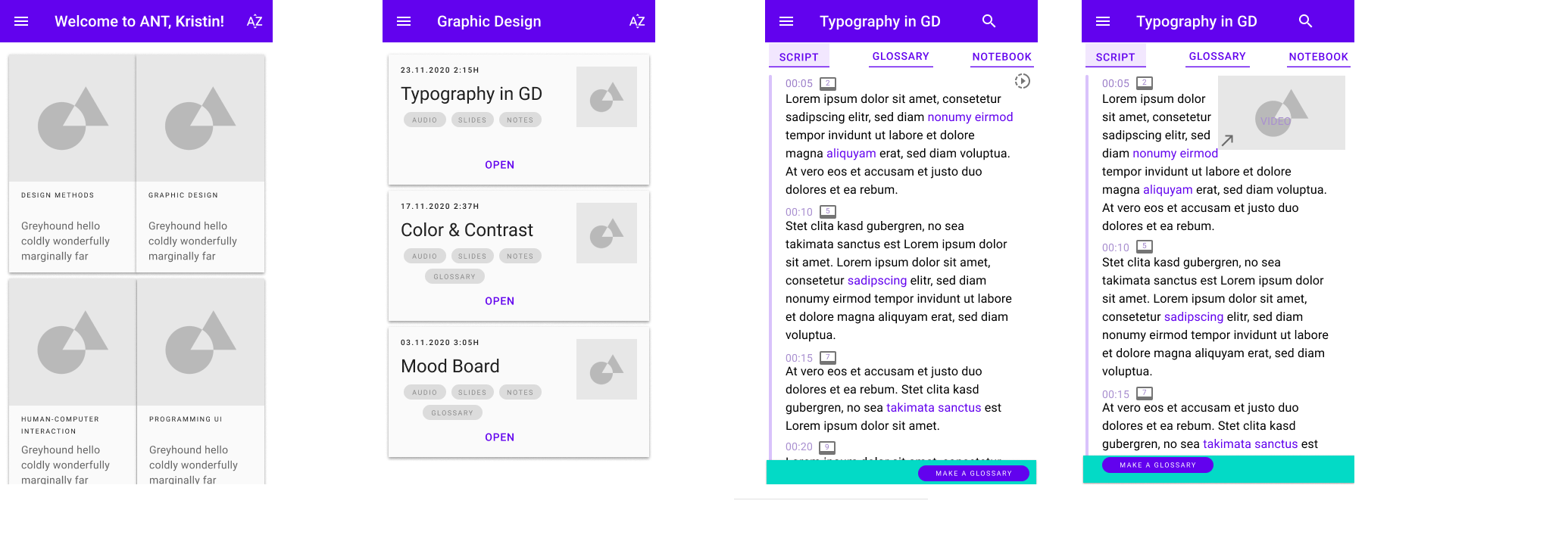
Real-time voice-to-text transcription that automatically syncs with presentation slides, eliminating the need for manual note-taking.
Automatic detection and integration of presentation slides, creating a seamless connection between visual content and notes.
Bright, uplifting color scheme and positive visual feedback designed to enhance student mood and reduce lecture stress.
Advanced search functionality that allows students to quickly find specific topics across all their synchronized notes and slides.
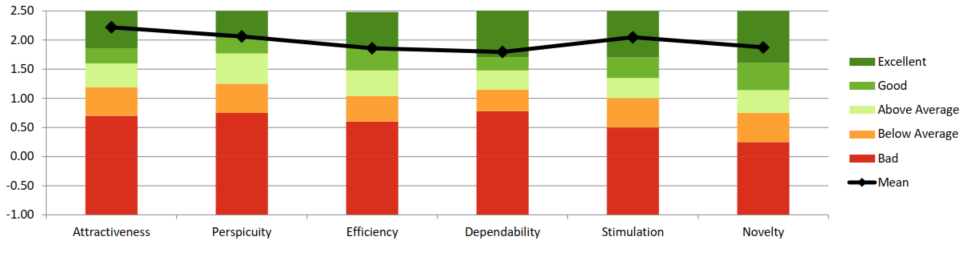
Students reported improved emotional satisfaction during lectures
Increase in focus and attention during class sessions
Reduction in stress and anxiety related to note-taking
Positive feedback on the bright, uplifting design
Focusing on emotional needs and using color psychology can significantly improve user engagement and satisfaction, especially in educational contexts.
Simplifying complex tasks and automating repetitive processes allows users to focus on what matters most - in this case, learning and understanding.
Understanding the specific context and emotional journey of users (students during lectures) is crucial for creating truly effective solutions.