02
Cashpool
Android Application
A mobile application that enables users to create teams and pool money towards common financial goals
A mobile application that enables users to create teams and pool money towards common financial goals
Cashpool emerged as my first-year thesis project at UPM, representing a comprehensive exploration of human-centered design principles applied to financial technology. The project's ambitious goal was to transform a conceptual idea into a fully functional Android application, systematically validating both user experience and interface design through rigorous research and iterative prototyping.
Over an intensive 90-day period from March to May, I collaborated with a diverse team of four professionals, each bringing unique expertise to the table. Our team composition included one programming specialist and two industrial design experts, creating a rich interdisciplinary environment that fostered innovative problem-solving approaches.
Within this collaborative framework, I assumed several key responsibilities that shaped the project's trajectory:
Days Duration
Team Members
Interviews Conducted
Our research methodology employed a sophisticated dual-approach strategy, engaging two distinct demographic segments—teenagers and adults—to capture the full spectrum of user needs and preferences. We implemented an innovative card sorting methodology that combined traditional physical card exercises with cutting-edge digital collaboration using MIRO, enabling us to identify and prioritize the most critical features for the application.
To deepen our understanding, we orchestrated realistic cash pooling simulations involving diverse participant groups, followed by an intensive series of 17 individual interviews. These interviews provided granular insights into personal financial behaviors, which we then validated through structured group card sorting sessions with six participants each.
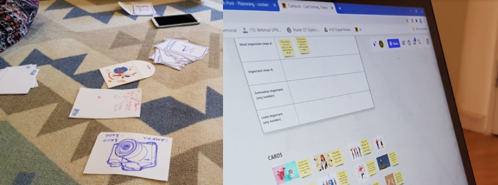
Card Sorting Activities - Physical (Left) and Digital (Right)
Our rigorous analysis revealed four distinct feature categories, each representing a critical dimension of user value:
Our research methodology progressed systematically from comprehensive user profiling to sophisticated behavioral modeling, culminating in detailed journey mapping that captured the complete user experience lifecycle.
Our analysis revealed fascinating behavioral patterns across demographic segments. Teenagers demonstrated a strong preference for purpose-driven features and goal-oriented functionality, while adult users prioritized transparency and trust mechanisms above all other considerations. This insight fundamentally shaped our feature prioritization strategy.
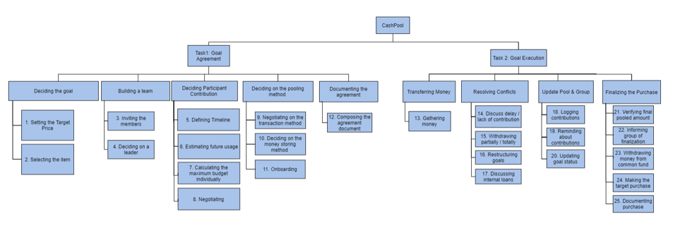
Task Organization Model
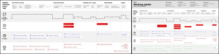
User Journey Maps
Our ideation process followed a systematic progression from conceptual sketching through iterative prototyping, with each phase building upon the insights gained from comprehensive usability testing.
Our sketching phase established the foundational user experience architecture, mapping the complete user journey flow and interaction patterns. We developed parallel design concepts for both mobile and web platforms, enabling us to explore platform-specific opportunities and constraints while maintaining consistency in core user experience principles.
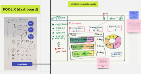
Sketches - Mobile (right) and Web (left)
Our low-fidelity prototyping phase employed a sophisticated approach using Balsamiq-style hand-drawn elements within Figma, enabling rapid iteration and early user feedback. We developed parallel prototypes for both mobile and web platforms, allowing us to validate core user flows and information architecture before committing to detailed visual design.
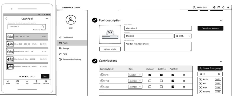
Lofi - Mobile (left) and Web (right)
Our high-fidelity prototyping phase yielded fascinating insights that fundamentally influenced our platform strategy. Despite the web version demonstrating superior usability metrics, user preference testing revealed a strong inclination toward mobile adoption, primarily driven by the inherent convenience and accessibility of smartphone platforms.
This counterintuitive finding highlighted the critical importance of platform choice in user adoption, even when technical usability metrics suggest otherwise. Our comprehensive Figma-based high-fidelity prototypes captured the refined user experience:
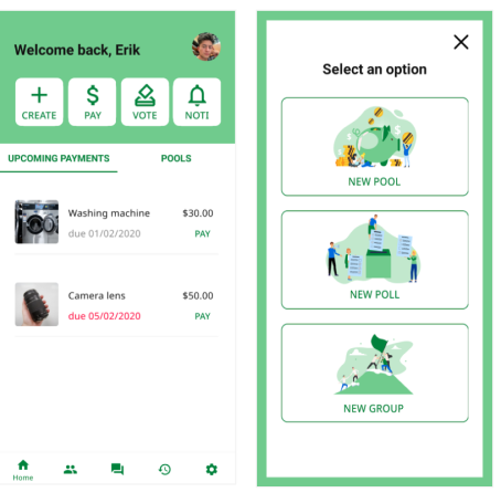
Figma Design of the screens
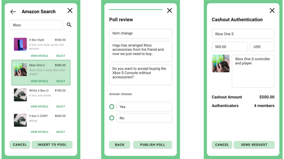
Figma Design of the screens
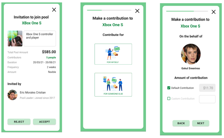
Figma Design of the screens
Our rigorous usability testing and evaluation process culminated in compelling evidence of the application's success, validating our human-centered design approach and providing clear direction for future development.
The application achieved an exceptional SUS Score of 84.38, placing it firmly in the "Excellent" usability category. With a Standard Deviation of 9.30, this score demonstrates consistent user satisfaction across diverse user segments, validating our design decisions and user experience strategy.
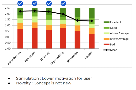
UEQ Results of the application
Our high-fidelity testing results exceeded expectations, confirming that the current design iteration meets production-ready standards and would deliver exceptional user satisfaction in real-world deployment. While we identified several refinement opportunities that could further enhance the user experience, the robust SUS and UEQ metrics indicate that the application already provides a highly engaging and intuitive user experience that meets our target audience's needs effectively.
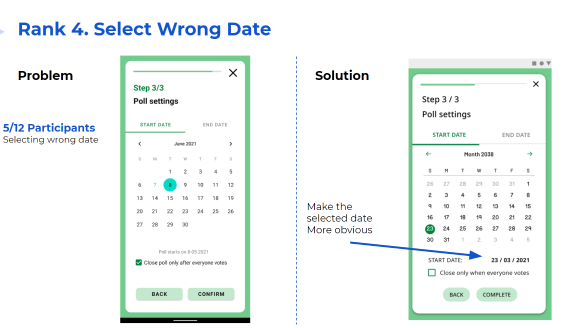
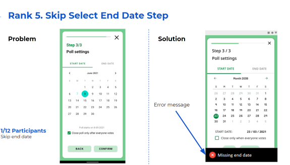
Our comprehensive analysis identified several strategic improvement opportunities that could further elevate the user experience. We systematically prioritized these enhancements based on their potential impact and implementation complexity.
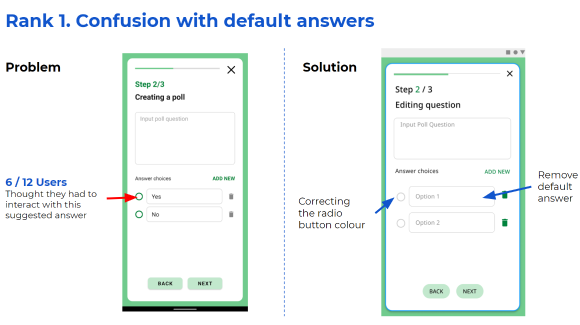
Improvement 1
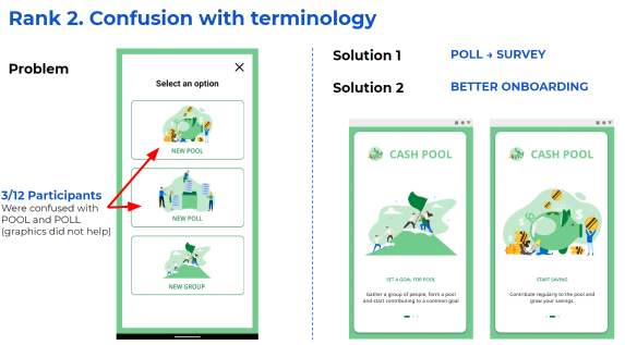
Improvement 2
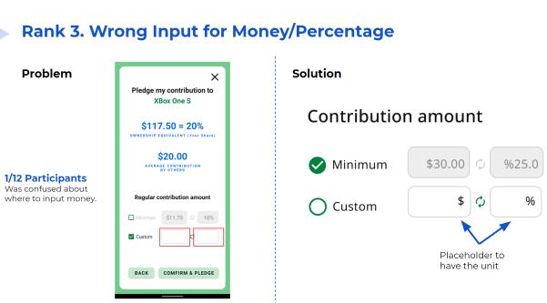
Improvement 3
Improvement 4
Improvement 5
To address identified stimulation and novelty challenges, we developed innovative gamification strategies that would enhance user engagement while maintaining the application's core financial functionality:
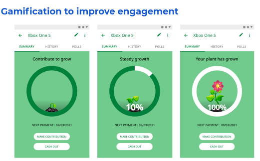
Gamification Ideas
SUS Score (Excellent)
Standard Deviation
Individual Interviews
Days Duration
Collaborating with professionals from diverse backgrounds—programming specialists and industrial design experts—revealed the transformative potential of interdisciplinary teamwork. This experience demonstrated how different perspectives can converge to create innovative solutions that transcend individual domain limitations.
Our research uncovered a fascinating paradox: despite the web version demonstrating superior usability metrics, users overwhelmingly preferred the mobile platform due to its inherent convenience. This insight fundamentally changed our understanding of platform strategy and highlighted the critical importance of user preference in adoption decisions.
The systematic application of research methodologies—from card sorting exercises to in-depth user interviews—provided a robust foundation for design decisions. This approach not only validated our assumptions but also revealed unexpected insights that significantly enhanced the final product's user experience.